If you’re familiar with South Korea’s digital ecosystem, you likely already know that Naver is the most popular search engine in the country. And if you aren’t, congrats you just learned something new!
Since Naver is the preferred search engine, it is also where most of the user data on South Koreans’ trending searches and search behaviors comes from. Any marketer interested in the region should understand how to find and analyze this data, so they can make informed decisions.
Thankfully, Naver has a handy tool for us marketers to do this – Naver Data Lab. The trick is simply trying to figure out how to use it.
Site Navigation
First things first, when you open the website, you will notice that it is all in Korean. If you don’t speak Korean, your head might already be spinning at this point.
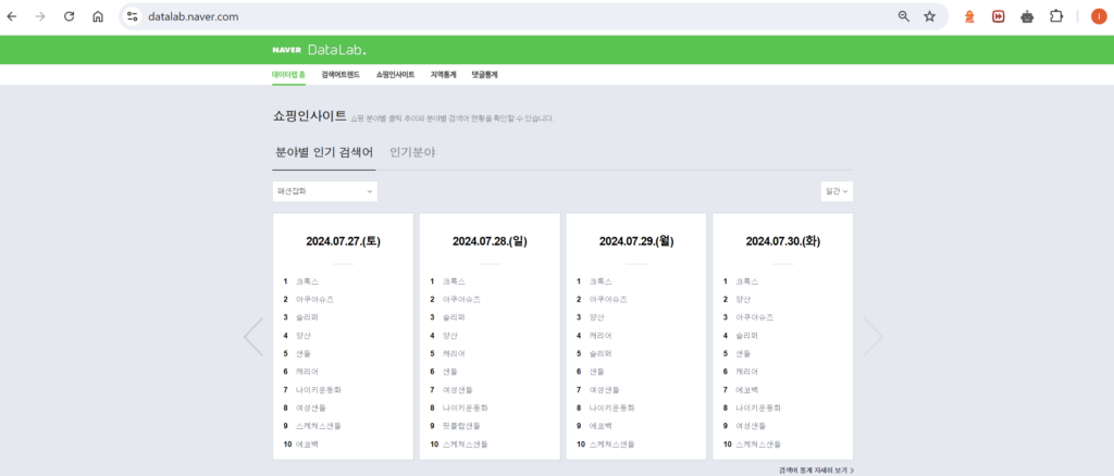
Thankfully, you can translate the page with Google. Much better, right?
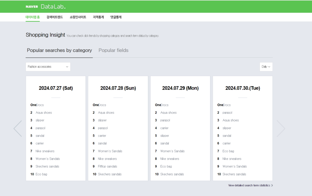
Now we can see that the home page shows us the most popular searches each day in each category. But that pesky navigation bar is still in Korean, so we’ve provided translations for your convenience:
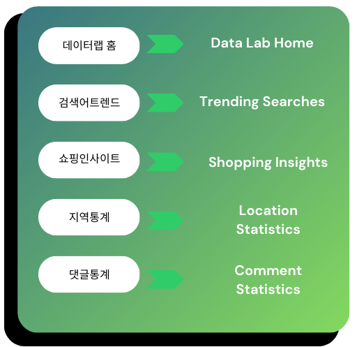
This will be enough for you to get the lay of the website, but having a professional who is proficient in Korean is still recommended, as Google Translate will often make mistakes, and researching keywords in a language you don’t understand can get tricky. If you need help conducting keyword research in Korean, you can reach out to our Korean SEO experts at InterAd.
Now that you know how to get the different pages, let’s look at what they actually are.
Trending Searches
Trending searches allows you to see how many times a search was made over a certain period of time. You can also filter the data by age, gender, and device, if you want to see how many people from a specific group are searching a certain term.
This is what the translated page should look like when you click on 검색어트렌드.
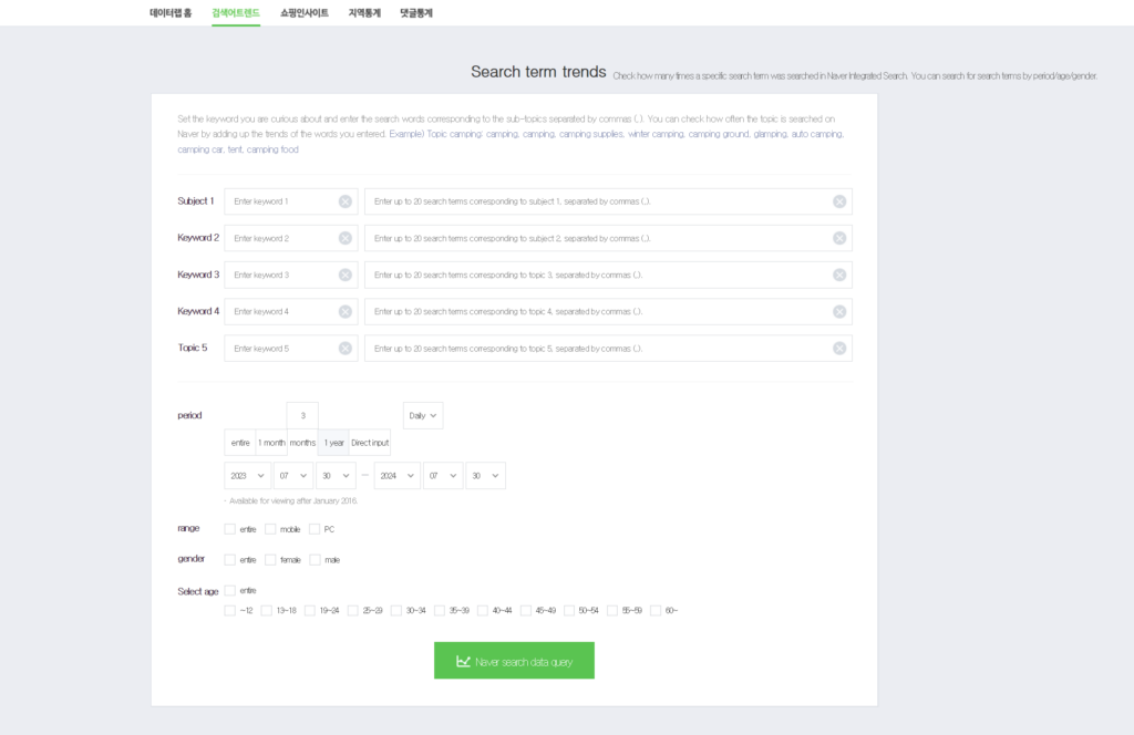
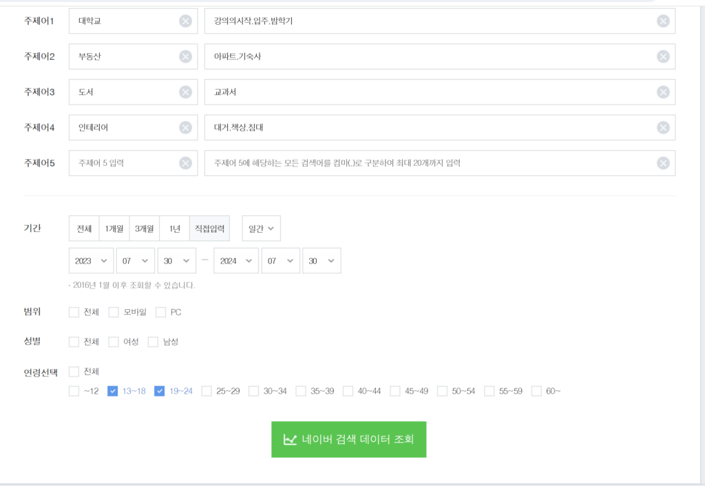
You can select up to 5 main keywords (주제); however, you can add an additional 20 related sub-keywords to each main keyword. For example, if one of your main keywords is boots, you can add the related keywords “Women’s boots”, “Men’s boots”, “rain boots”, etc. Searches made with those sub-keywords will count towards the total searches for your main keyword.
When typing your sub-keywords, also make sure to put commas between each one.
Once you have entered your keywords, set the period of time you wish to look at, and applied any desired demographic filters, click the green button at the bottom of the page, and it will generate a report for you.
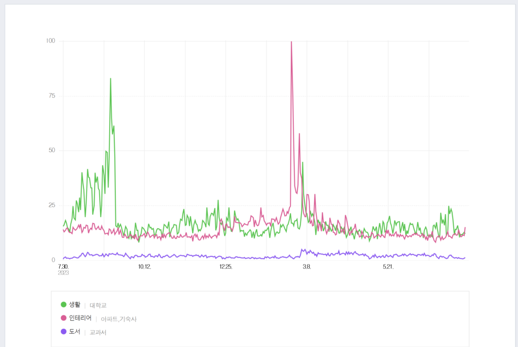
You can hover over the graph to see the search volume on a specific day. This graph allows you to compare the search volumes of different keywords to see if they are related. For example, here I searched for the sub-keyword 대학교 (University) under the main keyword 생활 (lifestyle), the sub-keywords 아파트 (apartment), and 기숙사 (dorm) under the main keyword 인테리어 (interior), and the sub-keyword 교과서 (textbook) under the main keyword 도서 (books). In this graph we can see a spike in both 생활 and 인테리어 around late February and early March. This makes sense because the Korean school year starts during March, so these spikes happening at the same time is likely because of incoming college students looking for housing and information about university life before the start of the new school year. On the other hand, books only saw a small spike, slightly afterwards, likely after classes start. This small spike might imply college students are more likely to look for housing online than textbooks, or that when they search for textbooks online, they are not using the keyword 교과서. Comparing what spikes together and when can help you make connections, and predictions about related products.
Shopping Insights
Shopping insights allows you to look at statistics regarding who is clicking on a kind of product during a period of time, and from which device they are clicking.
Shopping insights allows you to filter searches based on product categories and related keywords, consumer age, consumer gender, and what device the consumer used.
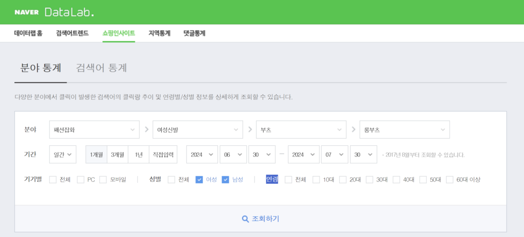
For example, in this screenshot, I had selected the general category of fashion, then narrowed it down to women’s shoes, then boots, then specifically long boots. I was interested in seeing how many men and women searched for the before mentioned search terms during the period of 6/30/24 and 7/30/24, and I did not specify that I wanted to see searches made on mobile or PC, or the age range of the consumers who searched it.
If I had wanted to, I could have selected searches made specifically by female consumers in their 20s and 30s who used their mobile devices to search for long boots, if I was only interested in those demographics. These filters can be useful for making sure you get the information that is applicable to your research.
Once you have selected the filters and search terms you want, you can press the gray button with the magnifying glass, underneath the filter options, in order to generate a report.
This is the report produced by my search:
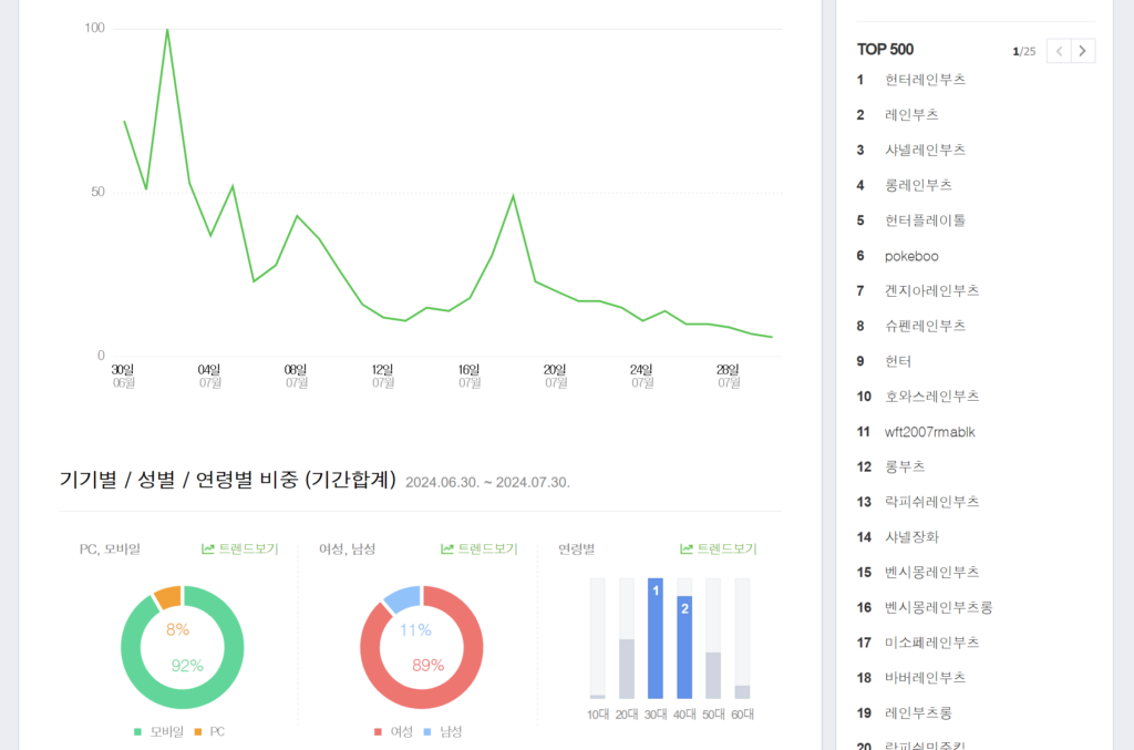
It shows the total search volume of all my selected search terms over my selected period of time. It also shows a device, gender and age breakdown below that. For instance, we can see that 92% of searchers used mobile, 89% were female, and the two largest age categories were searchers in their 30s and 40s. With this information, we can build a profile of the average user searching for our search terms: women in their 30s or 40s, searching on their phone, presumably while doing something else.
Shopping insights also provides a list of the top 500 most popular search terms in the general category you chose, so you can get ideas for more related keywords to use, and also to compare how often the search terms you chose are searched compared to other similar searches. For example, “long boots” is number 12 out of 500, which makes it a fairly popular search term. But if we wanted to include some search terms with higher search traffic, we can also use “long rain boots”, which is number 4.
Location Statistics
This tool lets you do exactly what you think it would, show you search trends by region. First, you select a major city or province. Cities will have “-시” at the end, while provinces will have “-도”. Then, select a district on the right.
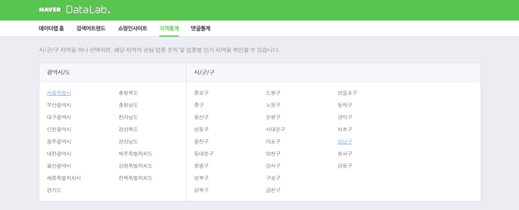
Our office is in Gangnam, so let’s select “서울특별시” (Seoul) and “강남구” (Gangnam District).
Scroll down, and you will see a sidebar with popular search categories, and a graph showing how many people in each neighborhood (neighborhood names will end in -동) searched for something under the selected category.
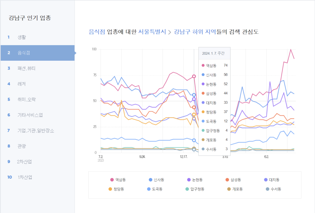
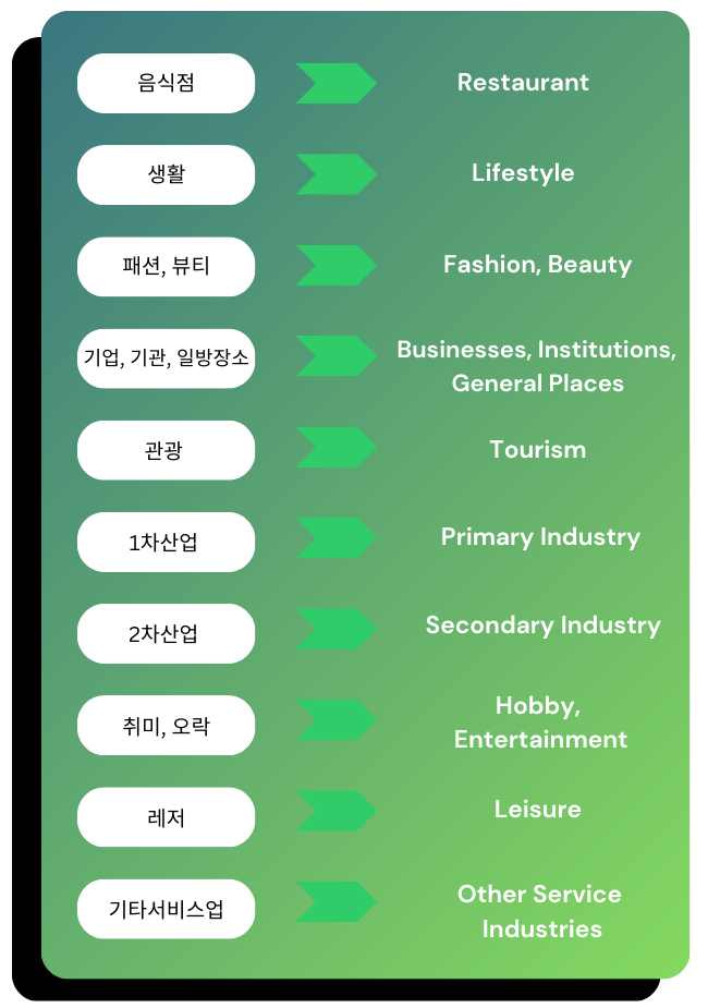
Here we have the category “Restaurant” selected, and if we hover over the graph, we can see that on 1/7/24, Yeoksam-Dong had the most users in Gangnam searching for restaurants.
The popular categories displayed on the sidebar and their rankings will change depending on what is popular in your selected region. However, here are some popular recurring ones and their English translations:
Comment Statistics
The comment statistics page allows you to look at the information regarding how many comments were made, from how many commenters, as well as the demographic make-ups of commenters.
Number of comments
The first statistic you can look at is the number of comments (댓글수).
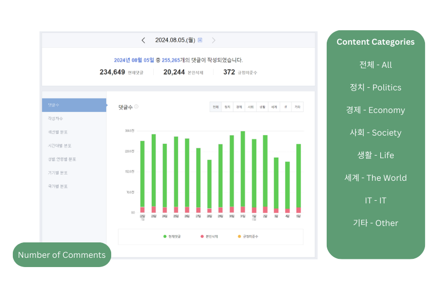
This will show you a bar graph showing how many comments were received each day starting from 2 weeks back from the date you selected above. Along the top of the graph, you will see a bar that allows you to see the topic of the content the comments were under.
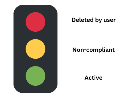
This tool also shows you how many comments were deleted by the user, marked non-compliant with TOS, and are active.
This feature is useful as it allows you to see what kind of content gets the most comments, but also get an idea of the quality of the comments.
For example, content that falls under the Politics and Society categories receive a lot of comments, but more of those comments end up either being deleted or marked non-compliant than comments under other categories. This implies that the comments under those two categories tend to be more controversial and offensive, and that you may want to avoid those kinds of topics.
Number of Commenters
The next statistic you can look at is the number of commenters (작성사주).
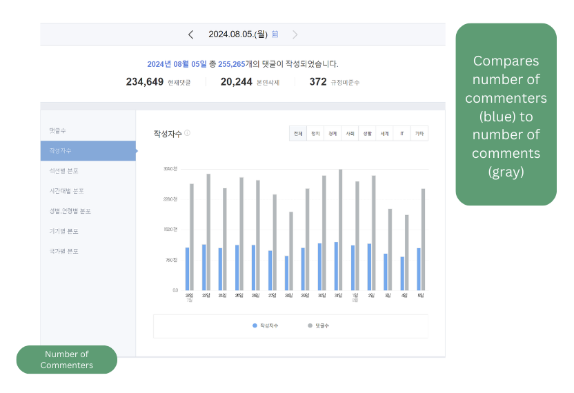
This allows you to compare how many comments were made versus how many people made comments.
This can be useful for determining if a topic is getting a lot of engagement from many unique users, or a small group of very engaged users. It also can give you a hint if your comment section may be at risk of receiving spam, if there is a small number of commenters and a disproportionately large number of comments.
Distribution by Section
After this, we can look at a breakdown comparing the number of comments from all the different topic categories in one pie chart.
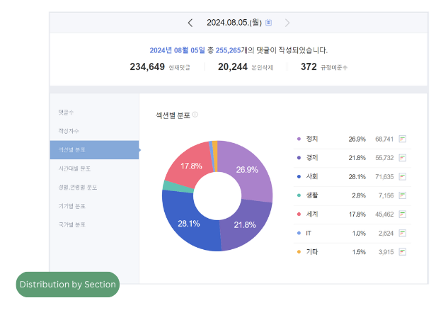
This allows us to see how many comments came from each topic category, and what percentage of the total comments they make up. This can help determine which topics receive the most engagement.
Hourly Distribution
This statistic focuses on how many comments were made each hour on a selected day.
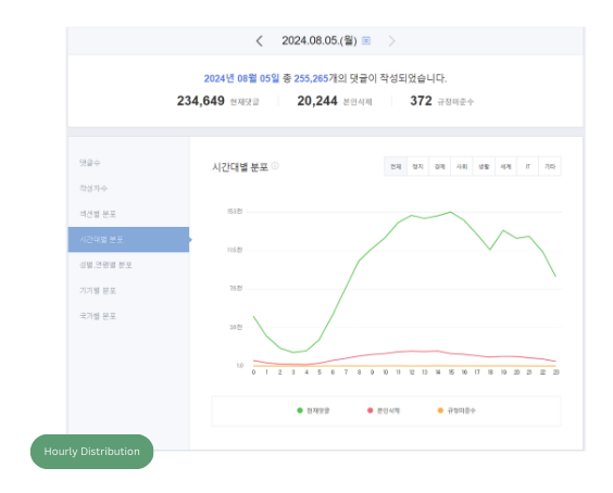
This graph also breaks down the comments into active, deleted by user, and non-compliant.
This lets you see when the most users are commenting, so you can plan your posting schedule around when users are most active.
It also allows you to see patterns in when deleted or non-compliant comments tend to be made, if that is a concern for you.
Commenter Demographics
After this the statistics focus on the demographic make-up of the commenters.
The statistics offered include:
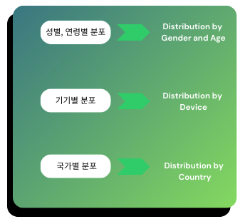
This allows you to see the age and gender breakdown of commenters, as well which device they are posting on and from which country.
For example, if most commenters for your topic are men and women in their 30s and 40s posting from the U.S., it might mean that your content is popular with older Korean professionals living abroad.
Conclusion
Hopefully now you have a better understanding of how to use Naver Data Labs to gain insight into Korean search behavior. This is a great, free tool to use to do basic market research on Naver.
However, if you’re still confused (it’s a lot of information, I know) or want more in-depth, professional market research conducted for your company, you can always reach out to our professionals at InterAd.